FRONT ROW
Client Portal
2023
The Problem
Client Portal is an important tool for communication between the agency and its clients. However, based on the client behavior, it was not performing great. Clients often reached out to our brand managers with many questions, and expected regular detailed reports, which kept our teams busy, and the need for new hires growing.
With the company partnering and expanding, rebranding was necessary, and the stakeholders requested a redesign of the Client Portal to make it match the new style guide.
Having my time limited to 2 weeks before the rebrand launch, I focused my efforts on producing the most significant improvements for both the clients and our teams:
Investigating the portal’s performance and finding ways to improve it;
UI redesign to match the new style guide.
User Research
Current Portal - Brand Summary Page
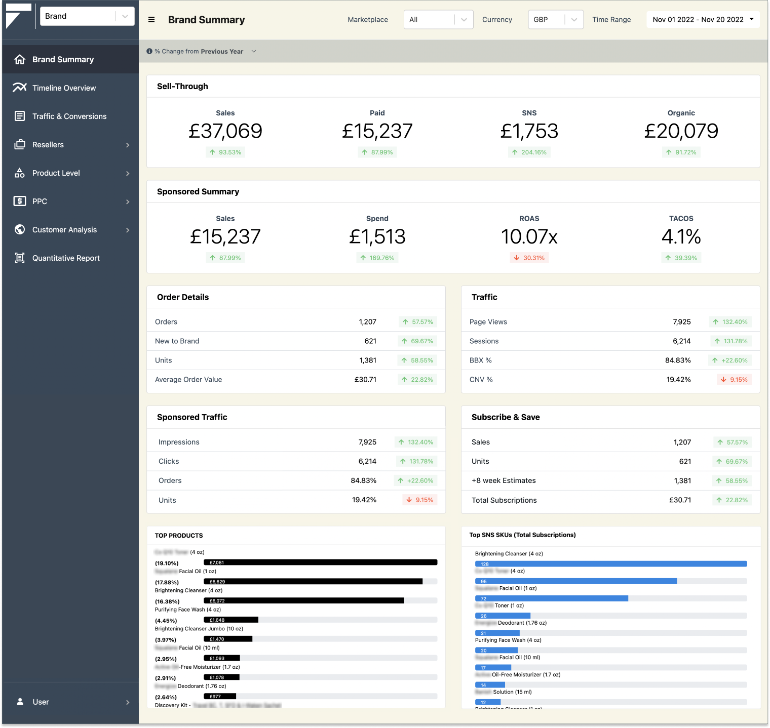
Current Portal - Timeline Overview Page

Heuristic evaluation findings
Monotonous tables overloaded with data. The information in the portal is displayed mostly in tables with many granular details and no visual hierarchy. The names of the navigation items and metrics are unclear. The information is often duplicated across different pages and not organized in a coherent way.
Inconsistent legend. In graphs all over the portal, the metrics have inconsistent colors and styles.
Poorly functioning time filters. On pages allowing time comparison periods, the time filters are not functioning properly, allowing the user to select different time periods for metric comparison, which is a major usability issue. For example, the user is able to select a year and then a week for a comparison period. This yields inaccurate results displayed on the page. Therefore the users don’t feel encouraged to rely on the information on the page.
Comparative and competitive analysis
Most marketing dashboards take advantage of data visualization and data hierarchy, and are selective in displaying the data. This seems to be a better approach to conveying the information efficiently, rather than displaying all available data in monotonous tables.
It became clear that we needed to better understand who our users were and their needs and struggles in order to improve the performance of the portal. After looking into the users and analyzing their concerns, I narrowed down my finding and created two user personas for this case.
User Personas
Persona 1.

MARISA - General Sales Executive
General sales executive for a company manufacturing high end skincare. She promotes products and negotiates contracts with the aim of maximizing profits. She researches new opportunities; recommends improvements and new sales strategies and channels.
Behaviors: Daily oversees performances of sales channels, marketing agencies and products to develop further strategies.
Needs and wants: Looks into performance of the agency representing her brand and needs a quick and clear overview. Wants to know what the agency is doing to protect their brand from illegal resellers. Needs to know how products are performing and which ones perform best.
Frustrations: Doesn’t have much time on her hands to look into tables to find particular metrics; doesn’t know all marketing metrics in detail and doesn’t need to see them all.
Persona 2.

JENNIFER - Digital Marketing Specialist
Digital marketing specialist for a company producing vitamins and supplements . Analyzes web traffic metrics and suggests solutions to boost web presence based on these metrics. Develops digital marketing strategies, trends and forecasts through monitoring of SEO٫ marketing٫ and sales performance metrics. Prepares reports for her higherups.
Behaviors: Looks in detail into various metrics, studies them and develops insights into marketing strategies for sales channels.
Needs and wants: needs the most up to date, well organized and highly detailed information in order to develop reusable strategies for multiple sales platforms. Needs to know which products perform best.
Frustrations: searching through endless tables requires exhausting levels of concentration and results in eye fatigue and loss of valuable time.
User Research Findings
The current portal is not addressing the needs of the user, because the information that they are looking for is hard to identify and find. The most important brand summary page contains too many granular details in the form of tables, and it requires a significant effort to single out the details that the user may be looking for.
The Improvement Solutions
Information Architecture
Reconfigure the contents of the site and the site map;
Rethink the navigation items titles;
Remove the information that is not helpful to the user.
Data visualization
Introduce more data visualization elements such as graphs and images;
Develop a new legend that is consistent with the new style guide.
New UI
Create a new, more modern and attractive design;
Consider information hierarchy for easier and faster perception of the information.
Information acrhitecture
With help of whiteboarding sessions and card sorting we conducted a thorough content inventory.
As a result, I was able to reconfigure the information architecture, navigation and contents of the brand summary page.

Brand Summary Page Redesign
STEP 1. Revisioning Brand Summary and integrating timeline overview.

STEP 2. Designing the new Brand Summary Page - greyscale prototype.

New UI
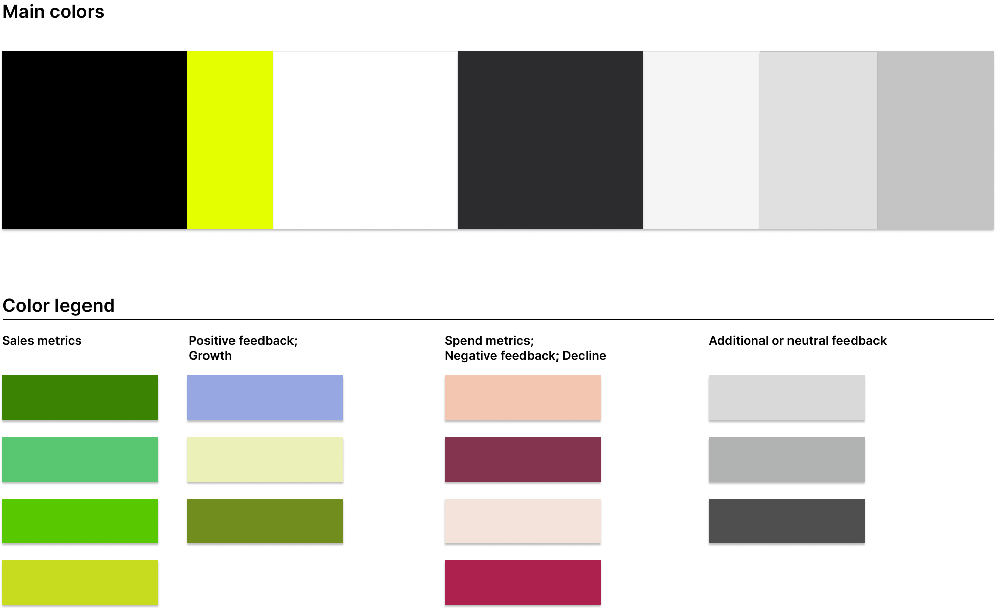
The new main site was designed by our partner company, and while using contemporary UI trends and being approved by the stakeholders, it had a different purpose than the client portal. It presented a challenge for designing the portal, because of the use of colors that were close to red and green - the colors that have a very distinctive purpose in marketing, usually representing growth and decline, or alarming metrics. In addition, some of the colors were highly saturated and contrasted, and hard to look at for a longer period of time, as user might do while looking at our dashboard.
I tried to overcome these issues by minimizing the use of bright colors, and repurposing some of the colors for the data visualization in the portal, to stay on brand.
I kept the fonts, buttons and other design elements consistent with the new style guide.
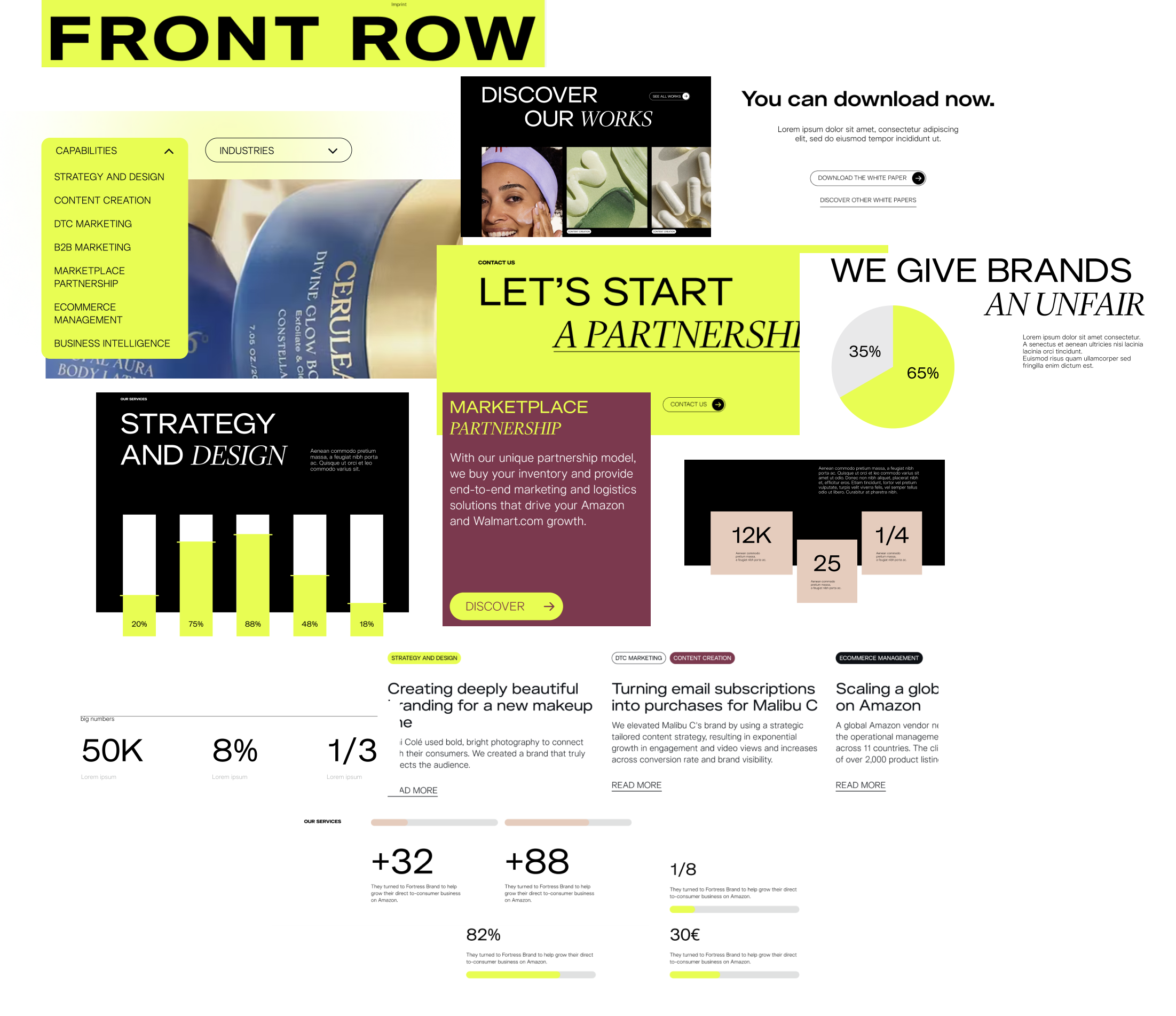
New style inspiration
New style guide and legend for the Client Portal
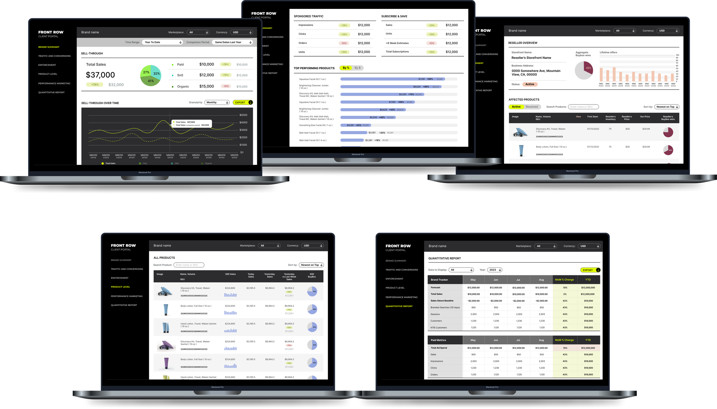
High fidelity prototype
New Brand Summary Page
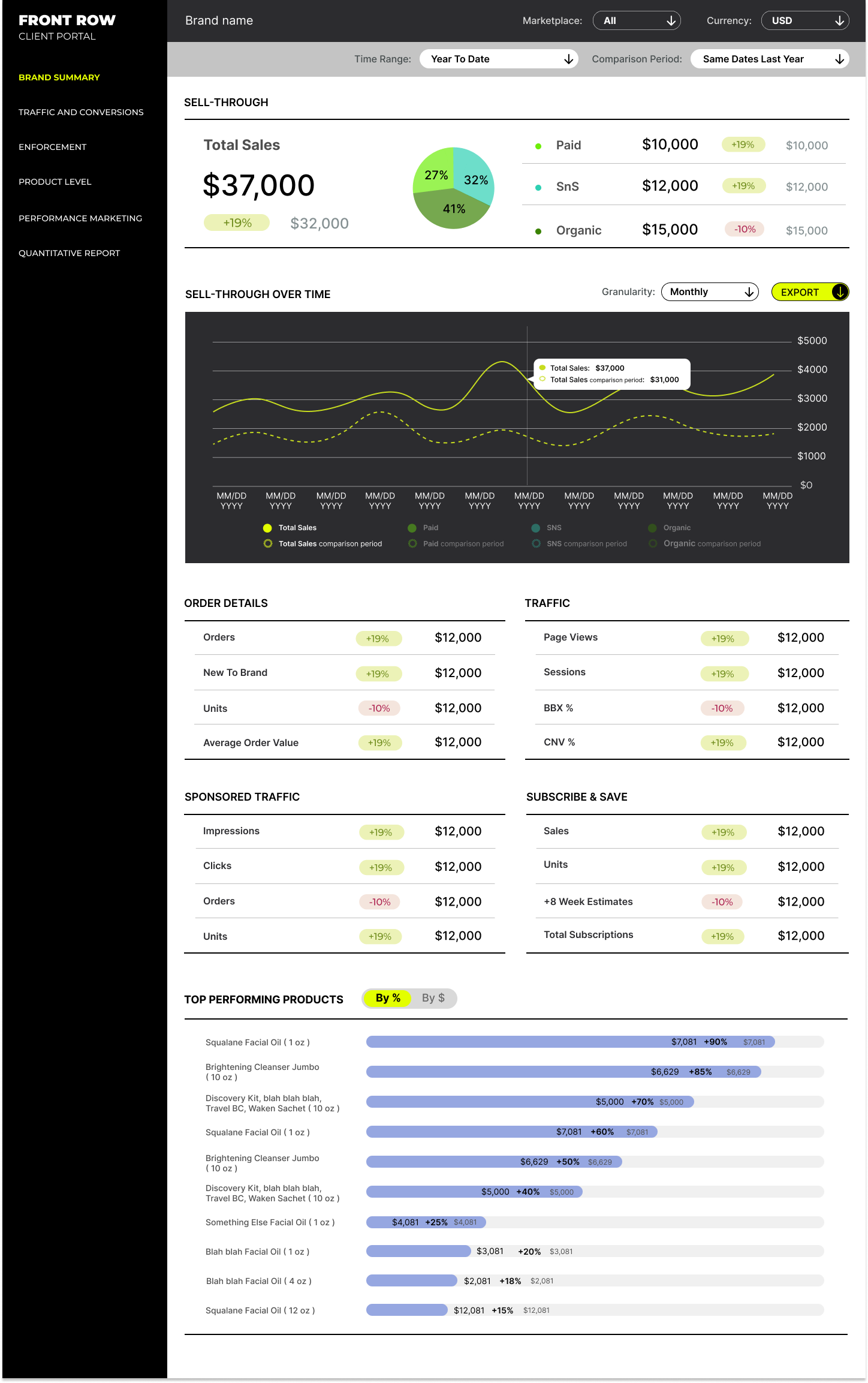
Time filters
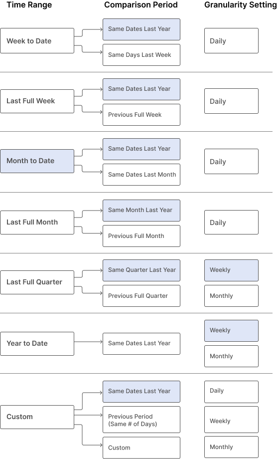
The user selects the time range first, then the comparison period, which will depend on the selected time range.
The granularity setting is applied to the table only and limited by the previous selections.
Fields highlighted in light blue are default settings.
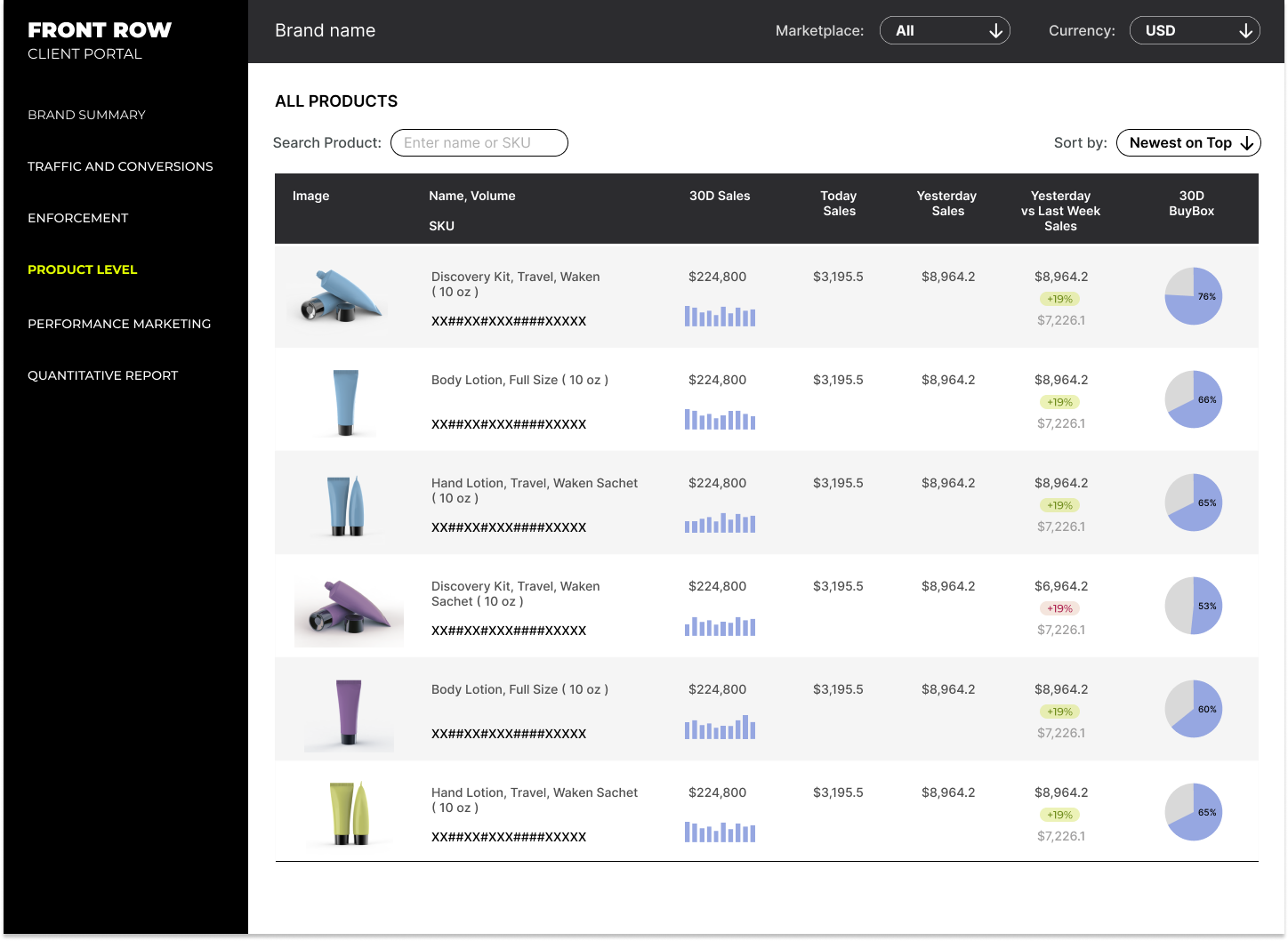
Product Level page
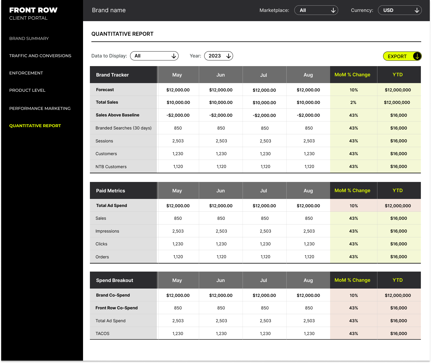
Quantitative Report
Enforcement Pages

The High Fidelity Prototype