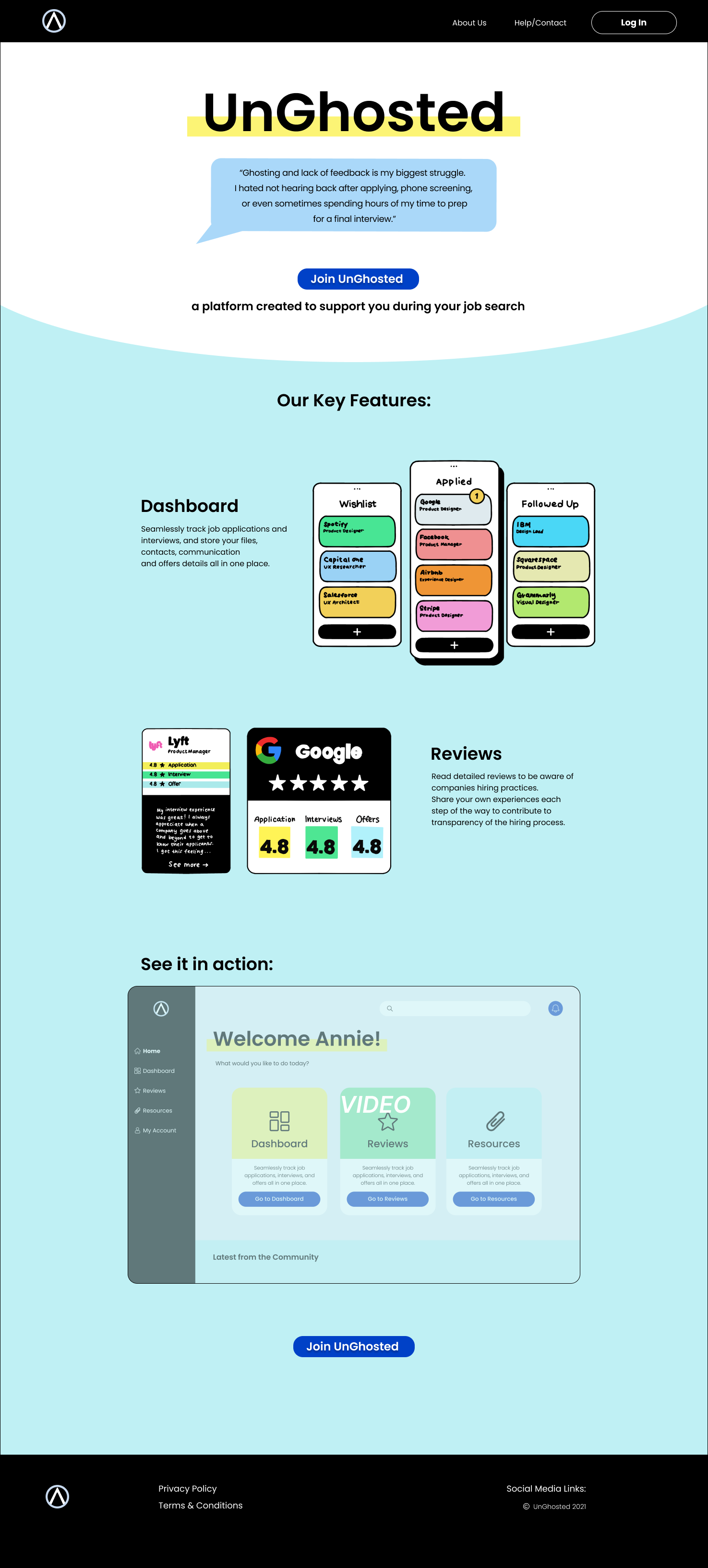
UnGhosted
to support you during your job search
2021
The Challenge
ElevateUp is a startup founded by two experienced recruiters. It builds products and services to empower the job seeker and also create accountability for all involved in the hiring process. The Client is looking to create an MVP application that lovingly disrupts the employer/job seeker dynamic by giving the power back to the job seeker by creating a user-powered reviewing system. Users will be able to provide honest, candid feedback about their experiences as a job-seeker, paving the way for a more equitable balance of power between companies and those seeking employment. The application will use a ticketing system to track the evolution of the job seeker’s experience from beginning to end.
User Research
The main focus of our UX research was on the user interviews. The client came to us with data from user feedback collected over time, which was supported by our own findings.
User Interviews
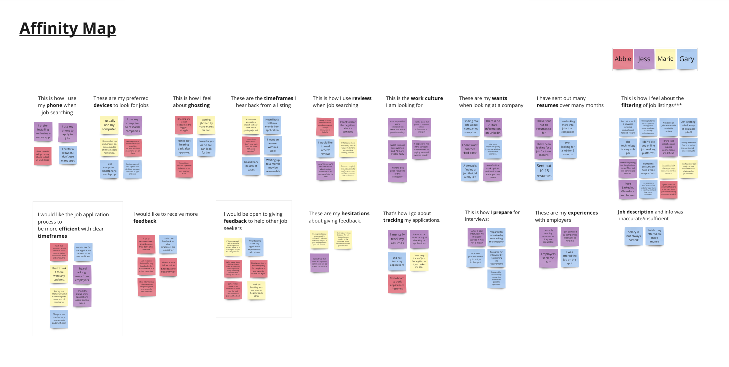
User Research Key Findings
Job seekers feel very frustrated when they don’t hear back the companies that they applied to;
They want a more transparent and efficient job seeking process;
They want to better understand companies’ hiring practices and culture;
Users are willing to share details of their job seeking experiences with others;
Job seekers have little trust in company reviews presented on the major employment websites.
User Persona

KRISTEN, 28 y.o. Product Manager
Unemployed due to layoff, needs new employment as soon as possible.
Behaviors:
Applies to multiple positions each day, often tweaks her resume to match the position requirements and writes cover letters;
Checks the status of her applications about once a week;
Takes notes on her glows/grows to improve for her upcoming interviews.
Needs and wants:
To find a job as soon as possible;
To be aware of the dynamics of the job market;
To be informed of the companies’ hiring practices and culture, and have a better understanding of her chances when applying to positions at companies and what to expect in the process.
Frustrations:
Having to wait for a response for a long time;
Having to manually track her applications and interviews individually and follow up with hiring managers;
Not knowing if or when she will hear back so that she can make a decision to move on;
Not hearing back after applying or interviews.
Now that we understand our user better, we can redefine the Problem.
The Problem
Job seeking process is tedious, anxiety provoking and requires a lot of mental and emotional resources. Users have to track their applications, often relying on memory, and don’t know what to expect during the process. It’s frustrating to not hear back after applying for jobs, and even more upsetting to not hear back after interviews.
The Solution
...might be an app that would…
Take advantage of a ticketing system to help users stay organized with their applications, interviews and their statuses, as well as keep all relevant files, notes and communication history in one place;
Send reminders to help users stay on track with their progress.
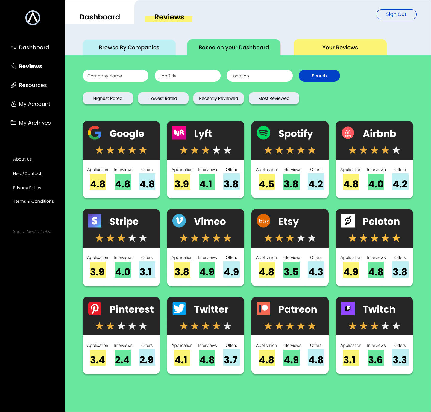
Allow users to post anonymous reviews about their experience with particular companies and read reviews left by others to become better aware of the companies’ hiring practices.
Greyscale Prototype
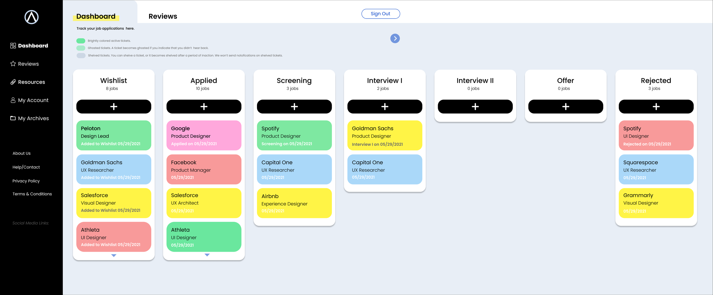
The Kanban Dashboard
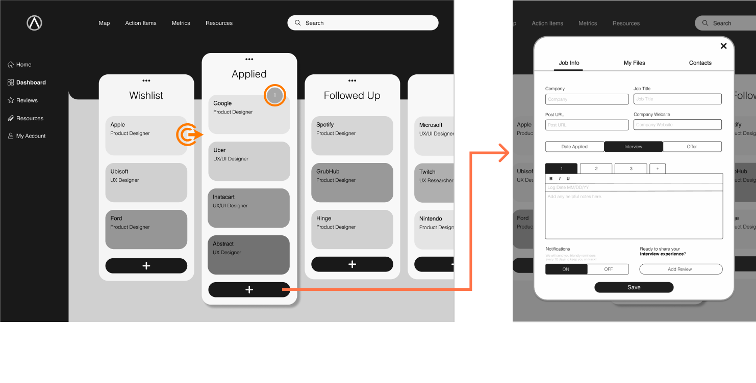
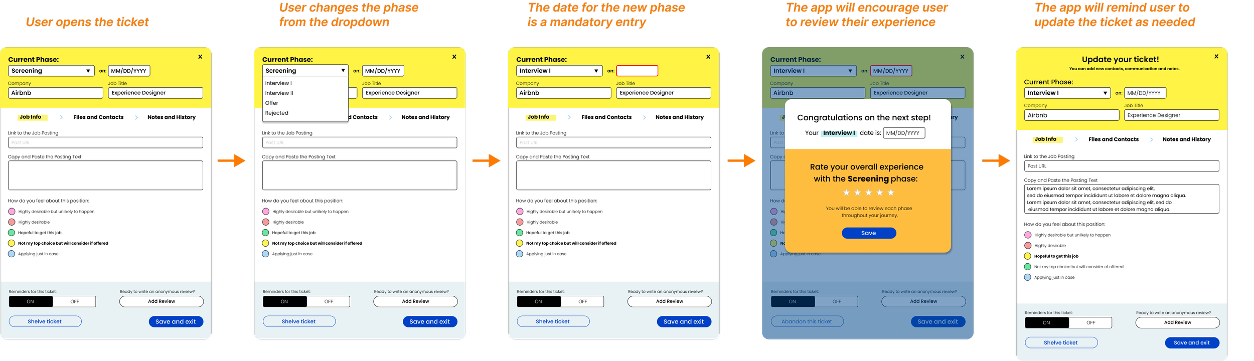
The Dashboard will feature columns representing phases of job applications. A job application ticket can be created in any column, and moved from column to any other column by dragging and dropping. A notification icon appears when a preset time has passed from creation of the ticket or its movement into a new column.
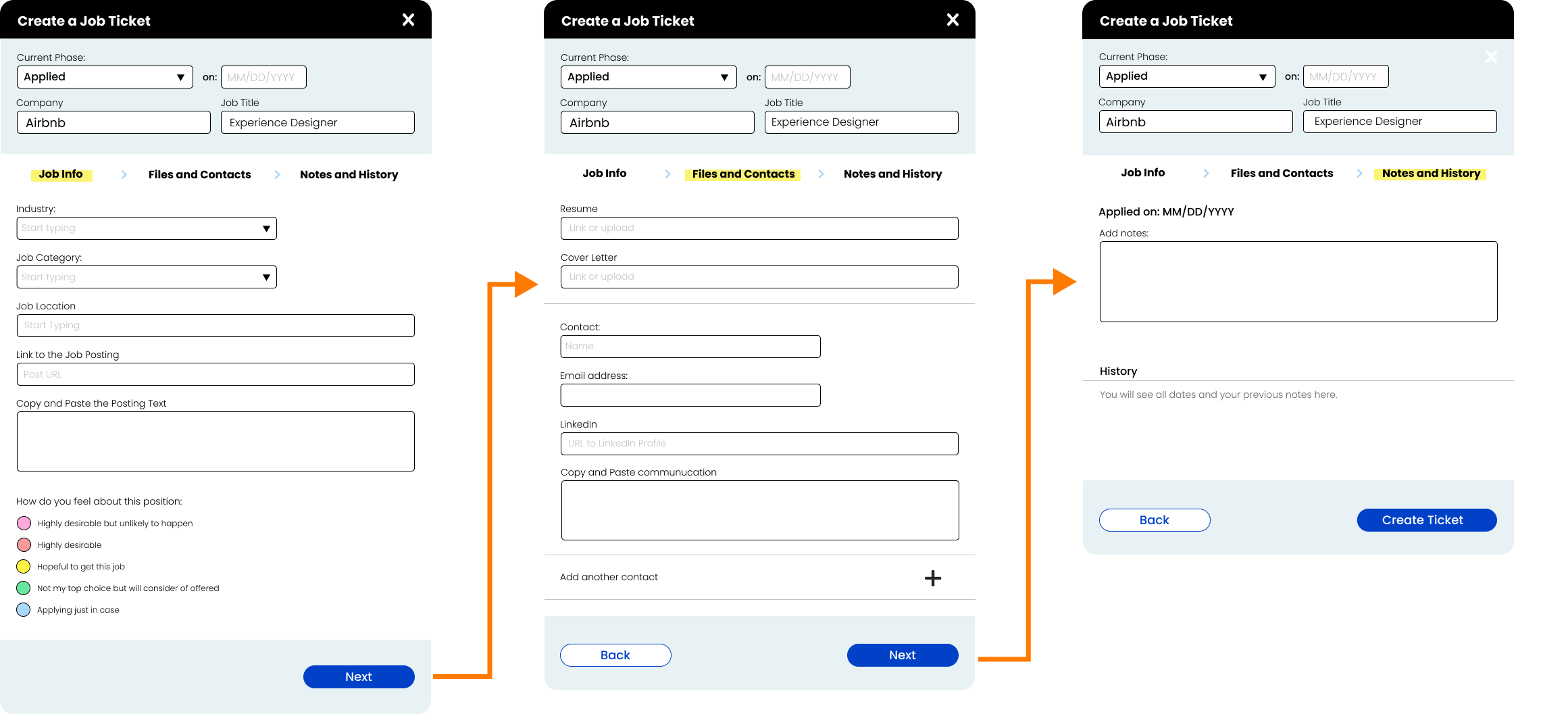
2. The Ticket

The ticket contains three sections:
The job details and the dates of the events related this this application;
The “My Files” files section that will allow to upload related documents;
Relevant contacts.
The Ticket Scenarios
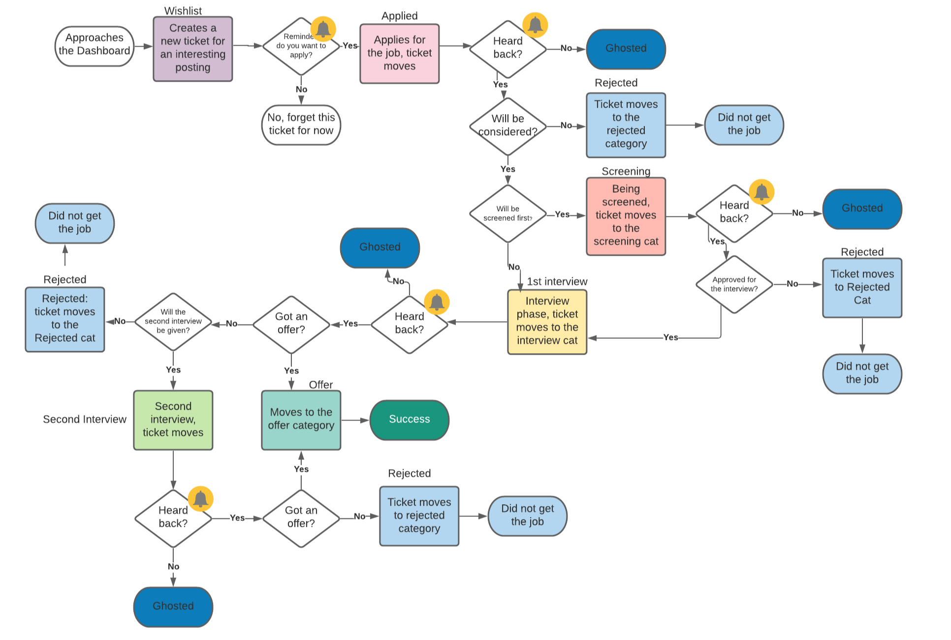
At this stage we defined the phases of job applications, what the user flows might look like, and when the user should expect to receive a notification from the app.
The phases of the applications for the MVP would be displayed as following:
Wishlist
Applied
Screening
Interview I
Interview II
Offer
Rejected
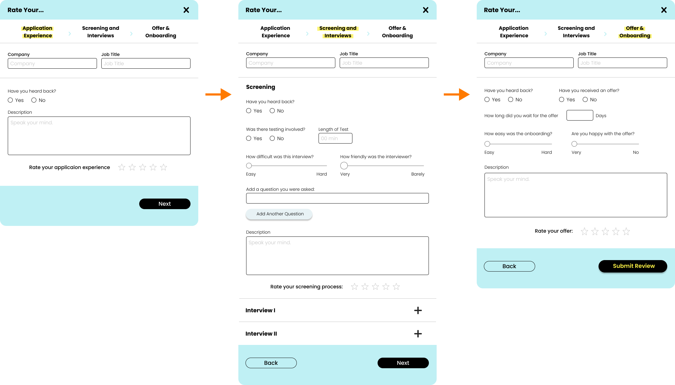
3. Creating reviews

Reviews will be the second heart of our app, along with the Dashboard, so we put in a lot of work into their design, with our main objective being to collect as much information as possible, while at the same time avoid overwhelming the user. We tried to include metrics as well as free text, and the start ratings for each step of the process.
The reviews will be displayed anonymously. Only registered users would be able to leave ratings and reviews.
Usability Testing and Iterations
User Tasks
To create a job application ticket;
To move ticket around the dashboard;
To create a review for the application experience.
Findings
The ticket’s 3 pages are confusing;
Drag and drop system can be limiting the possible interactions with the dashboard;
The review cards are still overwhelming despite our efforts.
Iterations
Improve the UI of the ticket, by making the steps more clear;
Add a function of moving tickets from status to status from within the ticket;
Further consolidate the review cards.
High Fidelity Prototype
Introducing color
In order to to make the user experience enjoyable and uplifting, we created a bright and cheerful color scheme for the main elements of the app.
We decided to, with help of color, to enhance and at the same time simplify user interaction with the dashboard. Rather than assigning colors to the tickets randomly, we allowed the user to color code the tickets.

The Landing Page
The Account Page
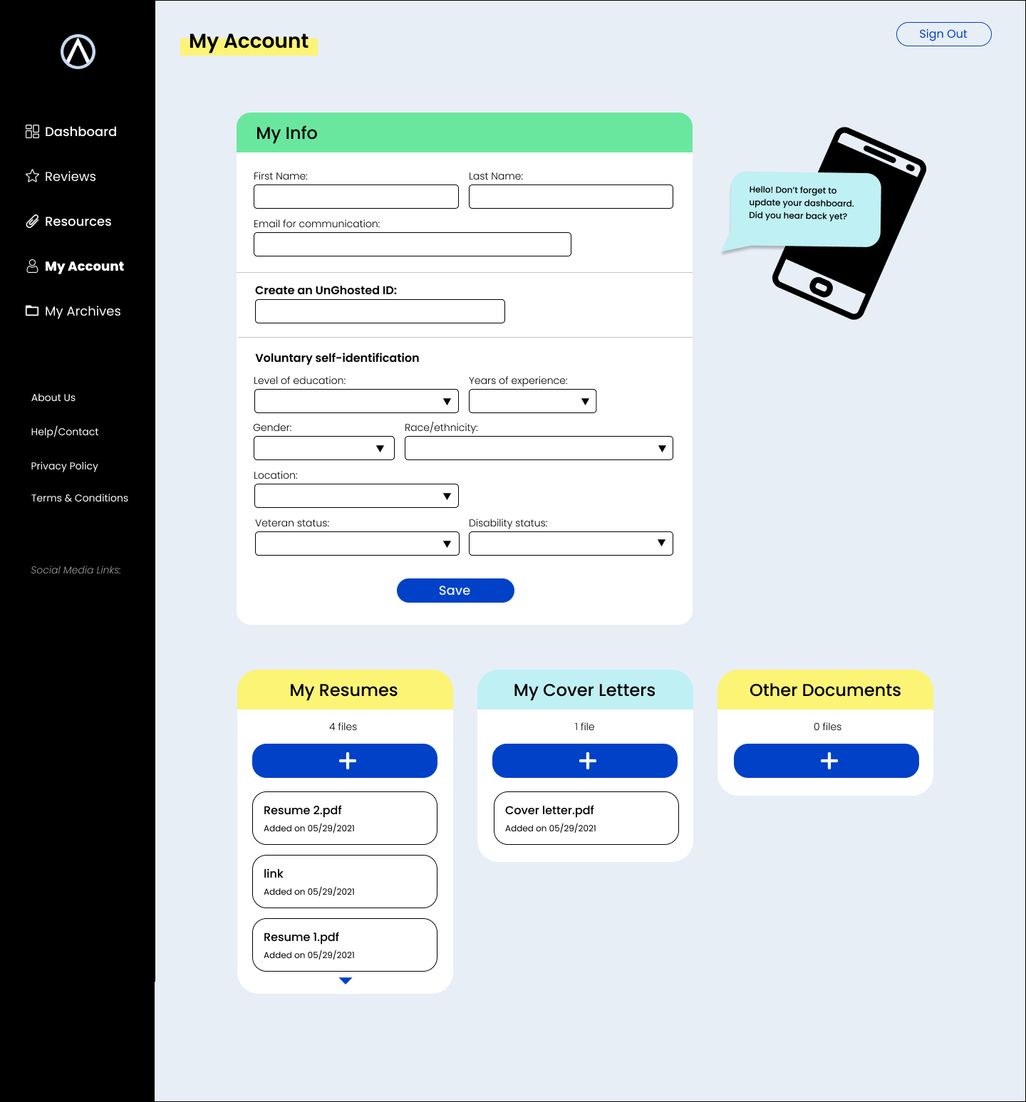
User must create an account in order to use the dashboard and create ratings and reviews that can be trusted.
The account page will allow us to collect statistically relevant information to generate prediction algorithms in the future.
This page also allows users to upload and store their documents.
The Dashboard
User can now not only drag and drop the tickets, but change the status from the ticket card.
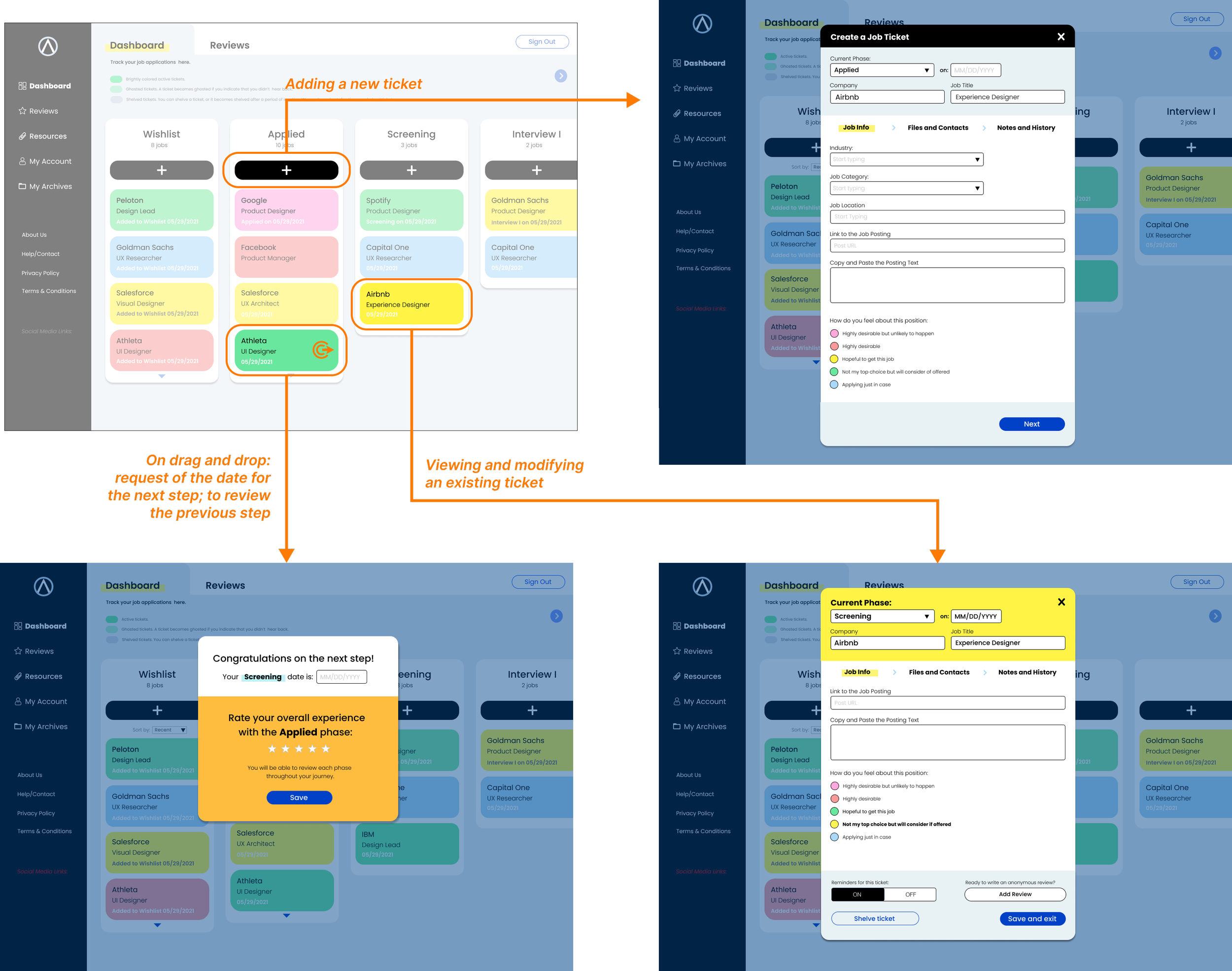
Creating New Ticket
Creating Reviews
The Reviews


High Fidelity Prototype
